Bug #7145
closedBootstrap layout broken in mobile since 4.0.5
0%
Description
Hello,
I upgraded to 4.0.5 recently and I noticed the bootstrap layout is not the same.
Here is the generated code by wt:
<div id="oh38exo" style="height:100.0%;"><div id="oh38ex0">
<div id="oh38ewz" class="navbar navbar-default">
<div>
<button id="oh38ewx" type="button" class="navbar-toggle btn btn-default with-label" style="display: none;">
<span class="icon-bar"></span>
<span class="icon-bar"></span>
<span class="icon-bar"></span>
</button>
<div class="navbar-header">
<button id="oh38eww" type="button" class="navbar-toggle btn btn-default with-label">
<span class="icon-bar"></span>
<span class="icon-bar"></span>
<span class="icon-bar"></span>
</button>
<a id="oh38ewv" href="/home" class="navbar-brand"><span id="oh38ewu"><i class="fa fa-external-link"></i> FileShelter</span></a>
</div>
<div id="oh38ewy" class="navbar-collapse" style="display:none;"><ul id="oh38ews" class="navbar-left navbar-nav nav"><li id="oh38ewr"><a id="oh38ewq" href="/home" class=" "><span id="oh38ewp"><span id="oh38ewo" style="white-space:nowrap;">Accueil</span></span></a></li><li id="oh38ewn"><a id="oh38ewm" href="/share-create" class=" "><span id="oh38ewl"><span id="oh38ewk" style="white-space:nowrap;">Nouveau partage</span></span></a></li></ul></div>
</div>
</div>
<div class="container">
<div class="jumbotron">
<div id="oh38ewb"><div id="oh38ewa">
<h1><i class="fa fa-download"></i> Téléchargement</h1>
<div class="form-horizontal">
<div class="form-group">
<label class="control-label col-sm-2">
Nom
</label>
<div class="col-sm-5 well well-sm">
small.txt
</div>
</div>
<div class="form-group">
<label class="control-label col-sm-2">
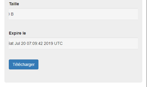
Taille
</label>
<div class="col-sm-5 well well-sm">
0 B
</div>
</div>
<div class="form-group">
<label class="control-label col-sm-2">
Expire le
</label>
<div class="col-sm-5 well well-sm">
Sat Jul 20 07:09:42 2019 UTC
</div>
</div>
<div class="form-group">
<div class="col-sm-offset-2 col-sm-5">
<a id="oh38ew9" href="/?wtd=llrFshG44NDZPt9B&request=resource&resource=oh38ew8&rand=337" class="btn btn-primary" target="_self">Télécharger</a>
</div>
</div>
</div>
...
And the layout is clearly not good on small devices (see attached files)
I also noticed a related problem when I wanted to change the background color of a bootstrap row.
Before the row was full screen width in small devices, now it seems to have 15 px margins on left/right.
What do you think?
Files
Updated by Roel Standaert over 4 years ago
- Status changed from New to Feedback
I think I'd need some more code, or something that would help me reproduce your issue. Just putting this generated HTML into a WText does not cause any issues.
Updated by Emeric Poupon over 4 years ago
Roel Standaert wrote:
I think I'd need some more code, or something that would help me reproduce your issue. Just putting this generated HTML into a
WTextdoes not cause any issues.
I reproduced the issue, it seems related to nested WTemplate and WStackedWidget.
Please find attached a test program.
On versions before 4.0.5, there is no truncation, the "well" is full width within the parent widget.
Updated by Roel Standaert over 4 years ago
- File issue_7145.cpp issue_7145.cpp added
I think this is related to the stacked widget getting an overflow: hidden automatically. The .well and .well-sm are making that one column oversized, and cause it to be cut off. I think you should maybe put the .well inside of the .col-sm-5 instead of as multiple classes on one div.
I attached a slightly changed version of the file you attached that demonstrates this.
Updated by Emeric Poupon over 4 years ago
Roel Standaert wrote:
I think this is related to the stacked widget getting an
overflow: hiddenautomatically. The.welland.well-smare making that one column oversized, and cause it to be cut off. I think you should maybe put the.wellinside of the.col-sm-5instead of as multiple classes on one div.I attached a slightly changed version of the file you attached that demonstrates this.
Ok that make the job done!
Thanks!
Updated by Roel Standaert over 4 years ago
- Status changed from Feedback to Closed